Custom colour scheme with Material3 Compose

Material 3 is the latest version of Google’s open-source design system. In this post, I will share my latest views on extending the colour scheme.
I will talk about two ways to extend the Material colour scheme: adding new colours and adding fixed colours. You can check out the end result in my project on Github, which is a movie app using The Movie Database API: https://github.com/herrbert74/FlickSlate
Material Theme Builder
The Material Theme Builder (MTB for short) has support for additional colours, so we will use it for this part. There is an official MTB website on material.io. Additionally, there is a newer or lesser known, more complete Material Theme Builder on github.io, which is more aligned with the newest changes in Material 3, so I recommend using the latter. I only explored the static colours, as I don’t feel the need to explore the dynamic colours yet.
MTB is also available as a Figma plugin, but I haven’t tried this yet. Was it a mistake? Let me know in the comments.
There are a few notable differences between the old and the new MTB.
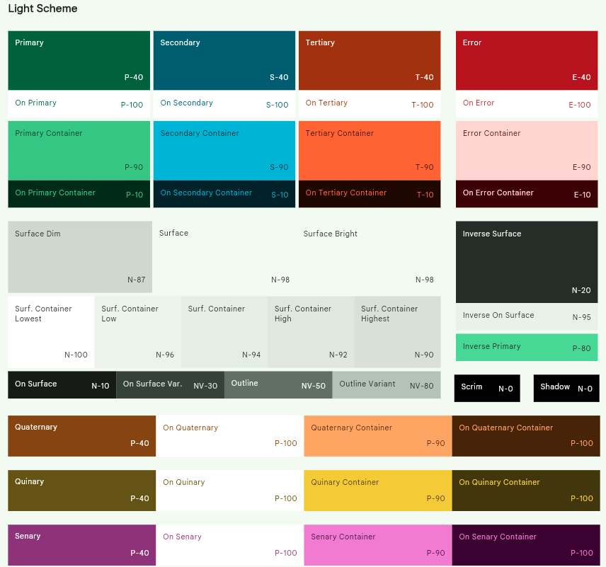
First, the new one doesn’t show the background colour anymore. It’s still exported in the result for legacy reasons, and looks the same as the main surface colour. This is the last remaining member of the original Android colour palette, and it’s finally been deprecated. Do not use it anymore. Use the main surface colour instead.
Second, the surface tint colour was replaced with the new surface container alternatives (a.k.a. variants, but it means something else here): dim, bright, and five colours from container-lowest to container-highest.
Third, the background and surface colours were toned down in newer versions of MTB. Previously, they could be tinted with fairly bright colours. Now this is toned down to a mostly greyish light or dark colour.
Fourth, apart from the normal light and dark palettes, the export contains a medium and high contrast version. In my opinion, the documentation is not very clear on how this should be used yet, but I think you can take the whole palette or just individual changes, whenever, whichever is needed. It will certainly be useful in accessibility situations. For now, I have omitted these from my app.
Create additional colours
Let’s say that I want to implement a search feature for my movie app, and additionally to the search, I want to add cards that will lead to a list of movies within a genre. There are 19 genres, so I could make the cards colourful by adding colour to our scheme and using the container colours for the cards. To limit the number of colours, let’s settle on six.
This is what I wanted to achieve:
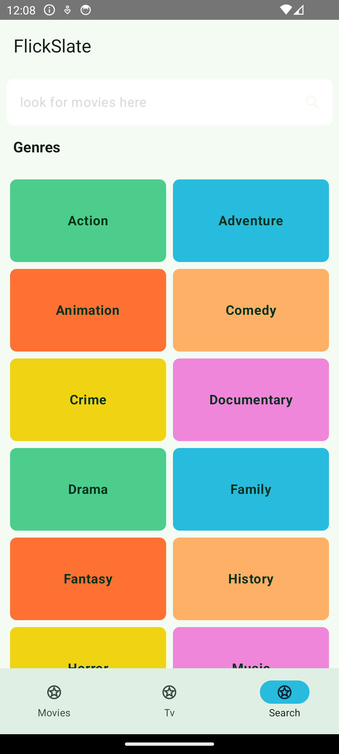
Notice that the first three are the container colours for primary, secondary, and tertiary. To name the remaining colours consistently, I will name them by continuing the M3 naming pattern by adding quarternary, quinary, and senary. I know, I had to look up the names, but I think staying consistent is important.
My initial idea to create the colour values was the following: in the MTB colour picker the hue is defined by a 360-degree scale. To get six distinct colours, we need to spread them out by a 60-degree hue. I could start with 0 and add 60 for each colour, but this was not satisfying. The blue colours occupy a long range, and are not distinctive enough. So I decided to start with 40, but replace a blue colour with an orange one, between red and yellow. I also mixed up the order of colours. This is how I ended up with 160 (green), 220 (blue), 40 (red) for the first three, and 60 (orange), 100 (yellow), and 340 (purple) for the rest.
This is how the colours looked at the end in the MTB:
Use the additional colours
The official documentation will give you a hint on how to add additional colours: ColorScheme.
Add a new data class for the colours you want to use:
1
2
3
4
5
6
7
8
9
10

    @Immutable
    data class AdditionalColorScheme(

        val quaternaryContainer: Color = Color.Unspecified,
        val quinaryContainer: Color = Color.Unspecified,
        val senaryContainer: Color = Color.Unspecified

    )
Add the colours generated by MTB:
1
2
3
4
5
6
7
8
9
10
11
12
13
14
15
16
17
18
19
20
21
22
23
24
25
26
27

    val quaternaryLight = Color(0xFF8E4F00)
    val onQuaternaryLight = Color(0xFFFFFFFF)
    val quaternaryContainerLight = Color(0xFFFFB067)
    val onQuaternaryContainerLight = Color(0xFF4E2900)
    val quinaryLight = Color(0xFF6C5E00)
    val onQuinaryLight = Color(0xFFFFFFFF)
    val quinaryContainerLight = Color(0xFFF0D313)
    val onQuinaryContainerLight = Color(0xFF483E00)
    val senaryLight = Color(0xFF963A87)
    val onSenaryLight = Color(0xFFFFFFFF)
    val senaryContainerLight = Color(0xFFEF86D9)
    val onSenaryContainerLight = Color(0xFF41003A)

    val quaternaryDark = Color(0xFFFFD5B2)
    val onQuaternaryDark = Color(0xFF4C2700)
    val quaternaryContainerDark = Color(0xFFF69F4B)
    val onQuaternaryContainerDark = Color(0xFF3F2000)
    val quinaryDark = Color(0xFFFFF2BB)
    val onQuinaryDark = Color(0xFF383000)
    val quinaryContainerDark = Color(0xFFE3C700)
    val onQuinaryContainerDark = Color(0xFF403700)
    val senaryDark = Color(0xFFFFACEA)
    val onSenaryDark = Color(0xFF5D0055)
    val senaryContainerDark = Color(0xFFDB75C7)
    val onSenaryContainerDark = Color(0xFF170014)
Create a CompositionLocal key that can be provided using CompositionLocalProvider:
1
2
3

    val LocalAdditionalColors = staticCompositionLocalOf { AdditionalColorScheme() }
Bind the key in your theme in Theme.kt to the actual values:
1
2
3
4
5
6
7
8
9
10
11
12
13
14
15
16
17
18
19
20
21
22
23
24
25
26
27
28
29
30
31
32
33
34
35
36
37
38
39
40

    @Composable
    fun ProvideColors(
        colorScheme: ColorScheme,
        additionalColorScheme: AdditionalColorScheme,
        content: @Composable () -> Unit,
    ) {
        val colorCache = remember { colorScheme }
        val additionalColorCache = remember { additionalColorScheme }

        CompositionLocalProvider(
            LocalAppColors provides colorCache,
            LocalAdditionalColors provides additionalColorCache,
            content = content
        )
    }

    @Composable
    fun FlickSlateTheme(
        isDarkTheme: Boolean = isSystemInDarkTheme(),
        isDynamicColor: Boolean = false,
        content: @Composable () -> Unit,
    ) {

        val colorScheme = ...

        ...

        ProvideColors(colorScheme = colorScheme, additionalColorScheme = additionalColorScheme) {
            MaterialTheme(
                colorScheme = colorScheme,
                typography = FlickSlateTypography,
                content = content
            )
        }

        ...

    }
Additional fixed colours
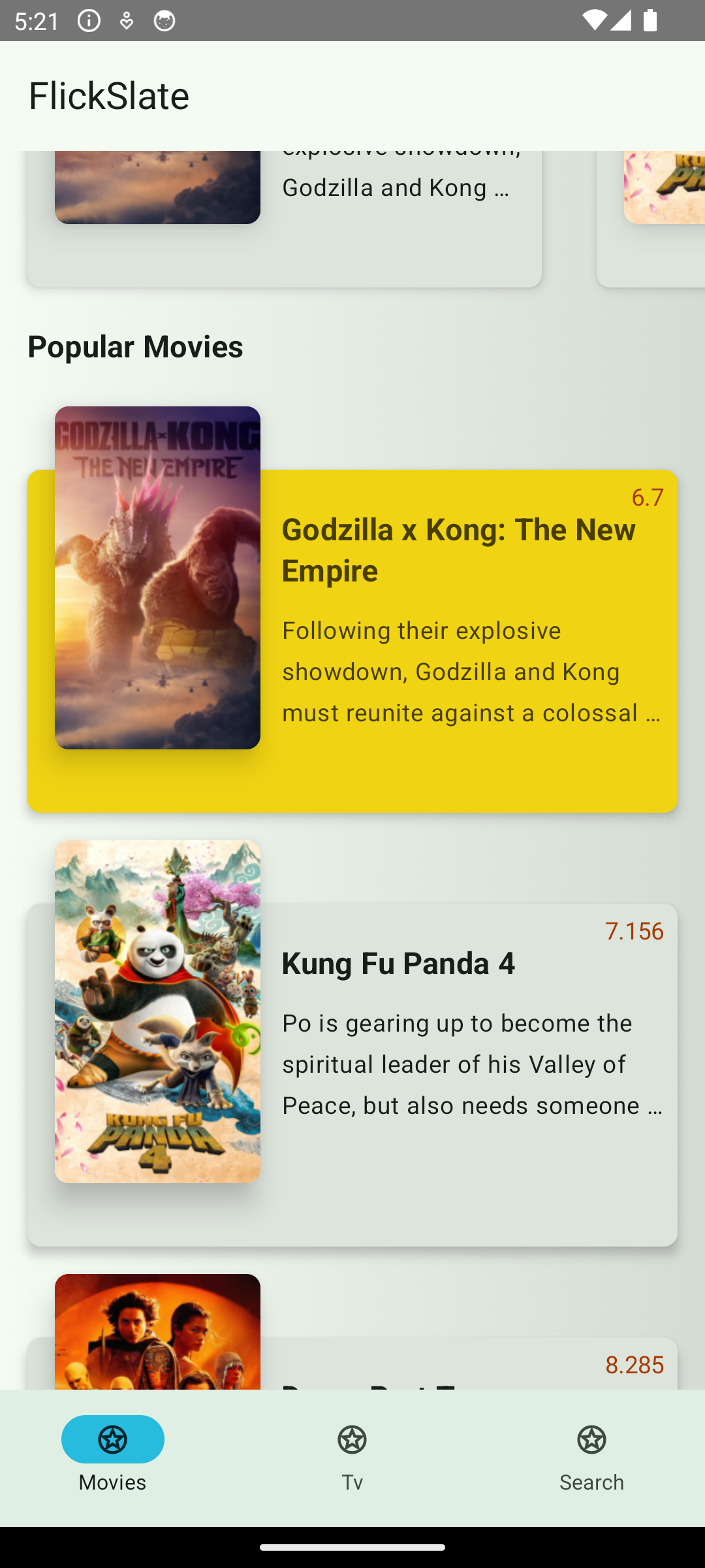
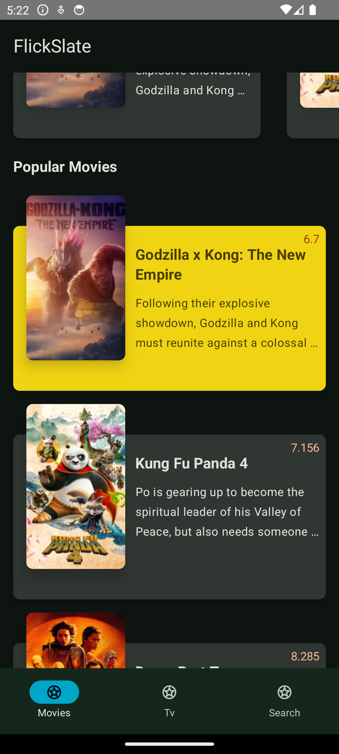
For this exercise, let’s assume that we want to keep the container of the most popular movie our quinary colour, which is yellow. The result will look like this:
Fixed colours are not supported in MTB, but you probably do not want to create completely new colours anyway. So we are going to reuse some existing colours.
In the past the recommendation for reusing colours was to have a separate semantic (names corresponding to the usage, like surface) and non-semantic palette (like laughing orange or egg white), and then in your semantic one, you refer to the non-semantic palette. This does not seem to be the case anymore; the MTB export uses only semantic names. I never followed this recommendation anyway, so I’m happy with this adjustment.
With this in mind, we declare FixedColorScheme as above, but instead of adding new colours, we reference colours we already have in our palette.
1
2
3
4
5
6
7
8
9
10
11
12
13
14
15
16
17
18
19
20
21
22
23
24
25
26
27
28
29
30
31

    data class FixedColorScheme(
        val primaryFixed: Color,
        val onPrimaryFixed: Color,
        val secondaryFixed: Color,
        val onSecondaryFixed: Color,
        val tertiaryFixed: Color,
        val onTertiaryFixed: Color,
        val quinaryFixed: Color,
        val onQuinaryFixed: Color,
        val primaryFixedDim: Color,
        val secondaryFixedDim: Color,
        val tertiaryFixedDim: Color,
    )

    fun getFixedColors() = FixedColorScheme(
        primaryFixed = primaryContainerLight,
        onPrimaryFixed = onPrimaryContainerLight,
        secondaryFixed = secondaryContainerLight,
        onSecondaryFixed = onSecondaryContainerLight,
        tertiaryFixed = tertiaryLight,
        onTertiaryFixed = onTertiaryContainerLight,
        quinaryFixed = quinaryContainerLight,
        onQuinaryFixed = onQuinaryContainerLight,
        primaryFixedDim = primaryDark,
        secondaryFixedDim = secondaryDark,
        tertiaryFixedDim = tertiaryDark
    )

    val LocalFixedColors = staticCompositionLocalOf { getFixedColors() }
And finally, we add them to the previously declared ProvideColors composable:
1
2
3
4
5
6
7
8
9
10
11
12
13
14
15
16
17
18
19
20

    @Composable
    fun ProvideColors(
        colorScheme: ColorScheme,
        additionalColorScheme: AdditionalColorScheme,
        fixedColorScheme: FixedColorScheme = LocalColors.current,
        content: @Composable () -> Unit,
    ) {
        val colorCache = remember { colorScheme }
        val additionalColorCache = remember { additionalColorScheme }
        val fixedColorCache = remember { fixedAccentColorScheme }

        CompositionLocalProvider(
            LocalAppColors provides colorCache,
            LocalAdditionalColors provides additionalColorCache,
            LocalFixedColors provides fixedColorCache,
            content = content
        )
    }
You can use the above colours in your Composables by using the current value from CompositionLocal, for example: LocalAppColors.current. If, like me, you find this a bit repetitive, declare static variables for them like this:
1
2
3
4
5
6
7
8
9
10
11
12
13

    val Colors: ColorScheme
        @Composable
        get() = LocalAppColors.current

    val AdditionalColors: AdditionalColorScheme
        @Composable
        get() = LocalAdditionalColors.current

    val FixedColors: FixedColorScheme
        @Composable
        get() = LocalFixedColors.current
What is still not addressed
Overall, I’m very satisfied with the new colour scheme. It addresses most of the problems I had previously with design(er)s. One issue is still not adressed, however.
What should I do when the brand colour is too light? The solution is still to just make a lighter version the primary colour, which is not acceptable for most businesses and designers. A partial solution is to enable the Color match option (or Color fidelity in Figma). This will flip the primary and primary container colours, which might or might not be satisfactory. Another problem is that it’s possible that the matching colour will only be a near match taken from the tonal palette, which might make eagle eyed designers and QA sad.
There is no obvious solution to this problem, so I recommend communicating this clearly to the decision makers, while also highlighting the above issues, and making sure they understand them.
Where to go from here?
There is still a lot to explore for me: try the Figma plugin, which has additional functionality like harmonise colours. Try the dynamic colours, for which I have found no use so far (is this a gimmick or is it cool?). Try harmonising the colours, which, according to the guidelines, are visually more pleasing.